


Nutrisystem App
Role
Company
Project Goal
The goal of the Nutrisystem app is to increase conversion rates by introducing a Build Your Own Plan questionnaire. This feature will allow potential customers to create a personalized weight loss plan based on their preferences, goals, and lifestyle. By offering a more customized and engaging experience, the questionnaire aims to build trust and confidence, encouraging users to commit to a plan that feels tailored to their needs. The result will be a higher conversion rate, fostering long-term success and customer satisfaction.
Deliverables
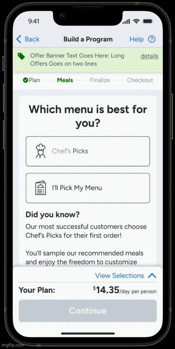
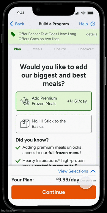
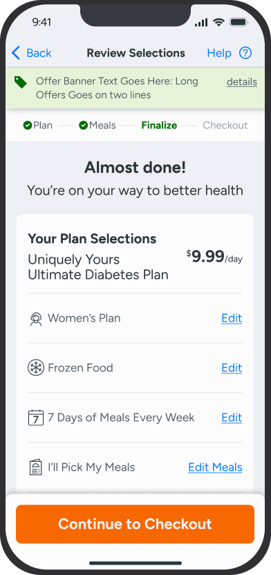
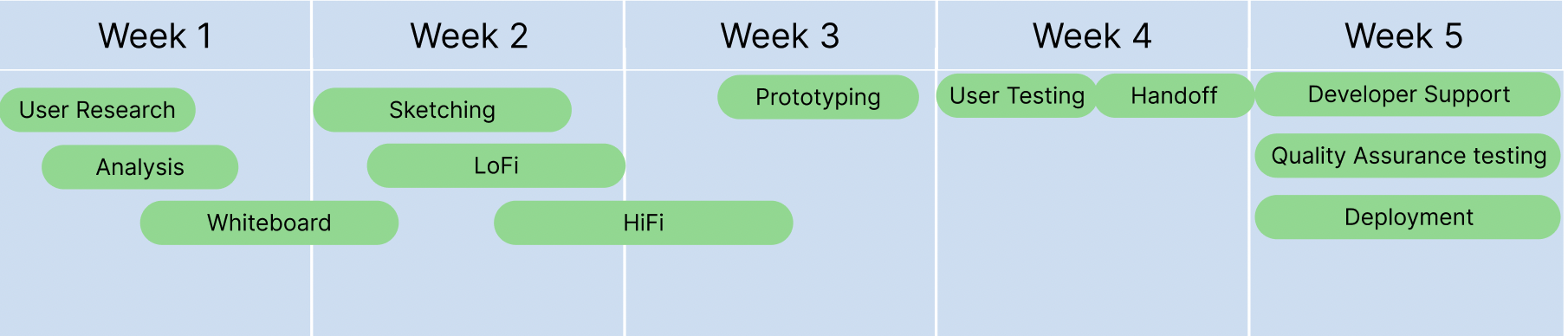
Userflow
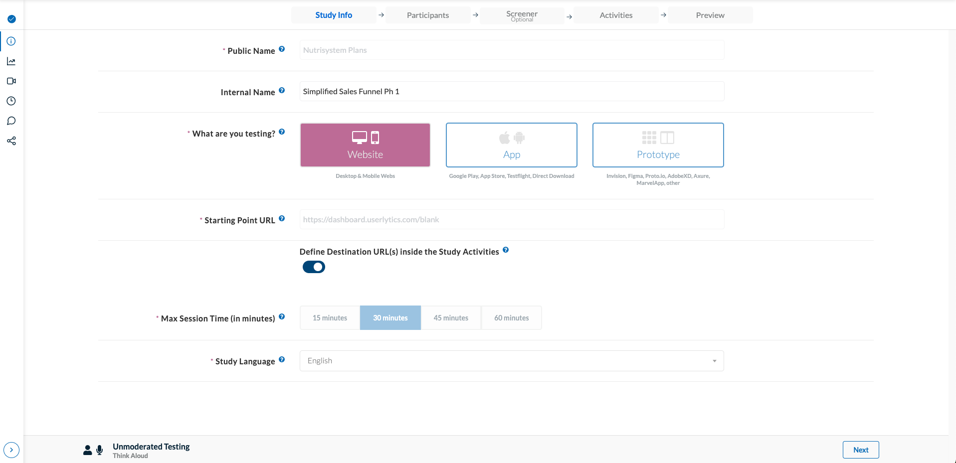
A well-structured user flow is essential for the success of the Build Your Own Plan questionnaire, ensuring a seamless and engaging experience that guides users toward conversion. By mapping out each step, from initial questions to personalized plan recommendations. The user flow helps eliminate friction, reduce drop-off rates, and keep users engaged. A clear, intuitive flow ensures that users receive relevant options quickly, reinforcing confidence in their choices. By optimizing the journey, the user flow plays a key role in driving higher conversion rates, making the process efficient, user-friendly, and goal-oriented.
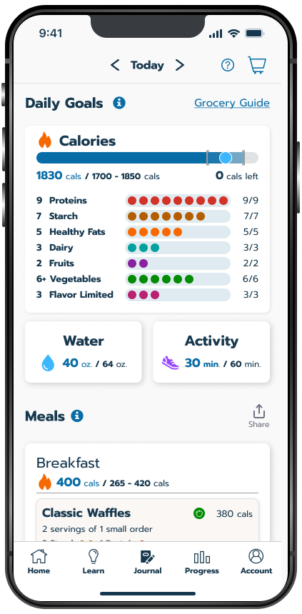
Data Driven
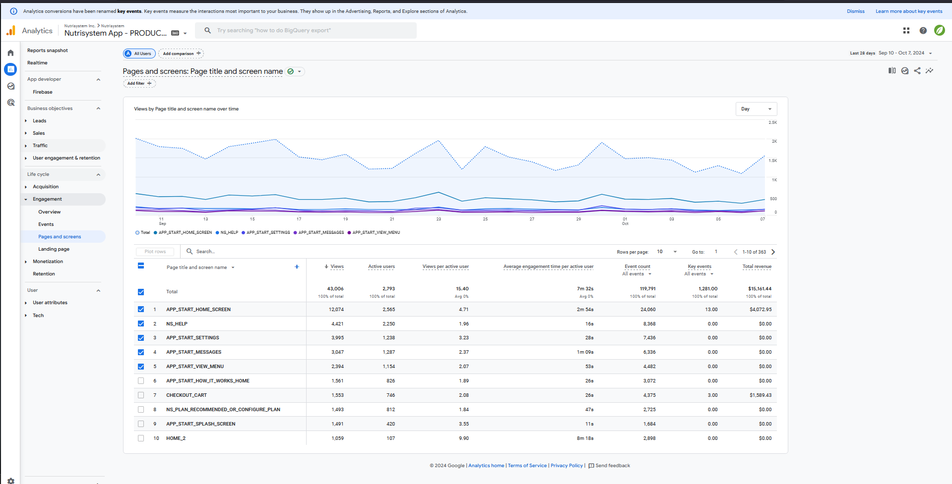
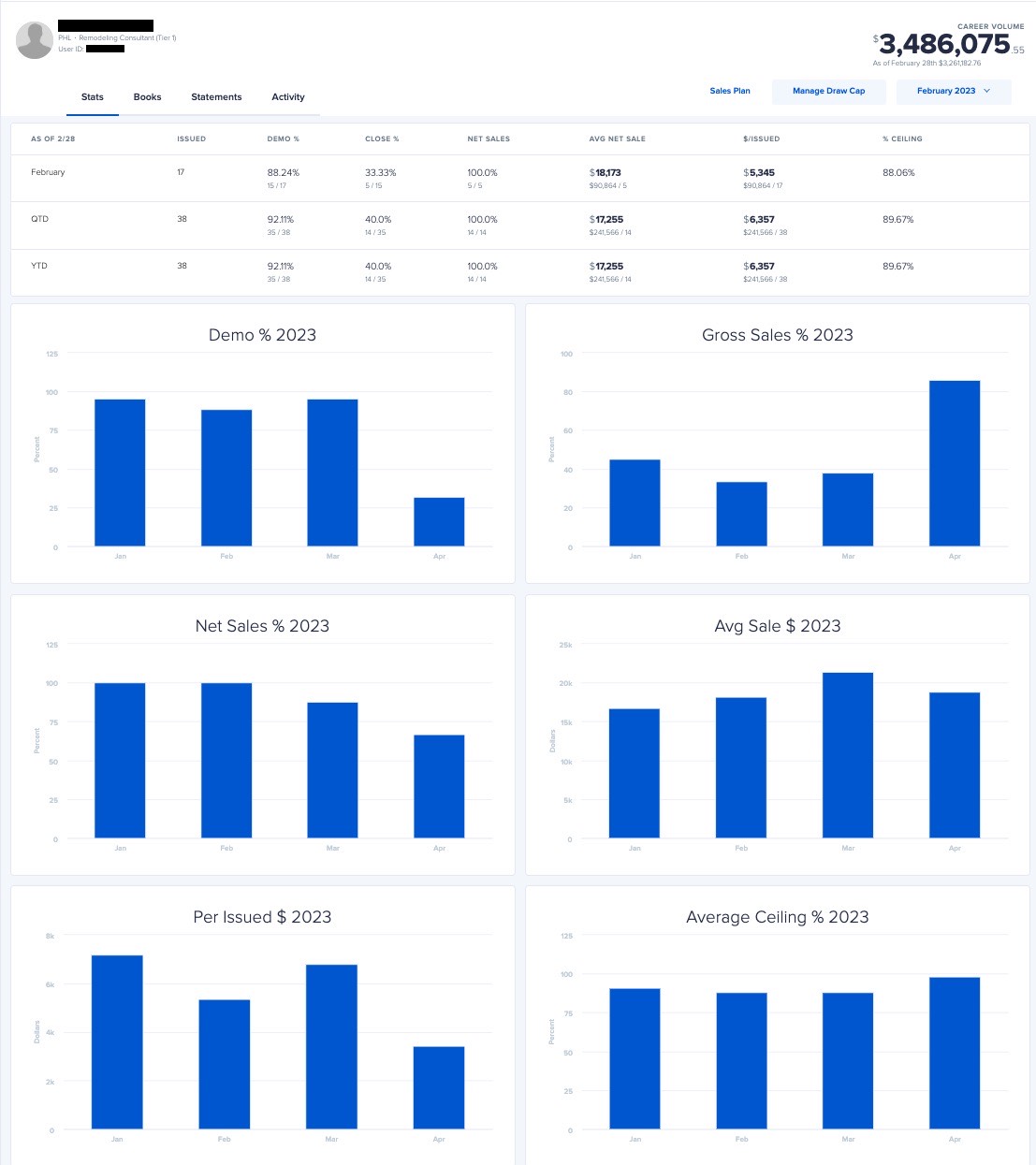
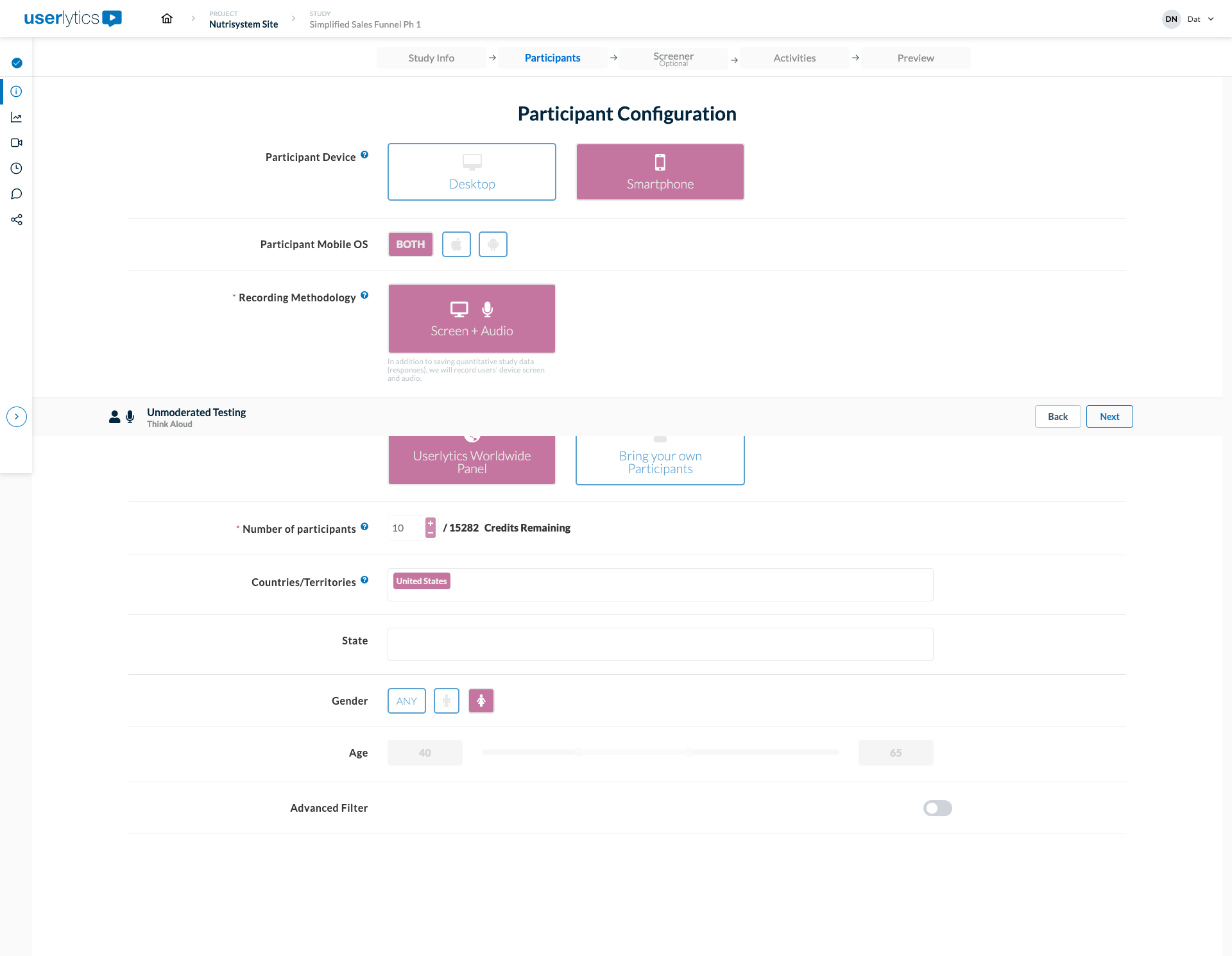
Analytics play a crucial role in optimizing the Build Your Own Plan questionnaire and increasing conversion rates. By tracking user behavior, drop-off points, and engagement metrics, we can identify where users lose interest or abandon the process. A/B testing different question formats, layouts, and CTA placements helps refine the experience for higher engagement. Heatmaps and session recordings provide insights into navigation patterns, allowing for UI improvements that enhance clarity and ease of use. Additionally, analyzing conversion funnel data helps pinpoint which steps lead to the most successful sign-ups, enabling data-driven optimizations that make the journey more seamless, personalized, and effective.
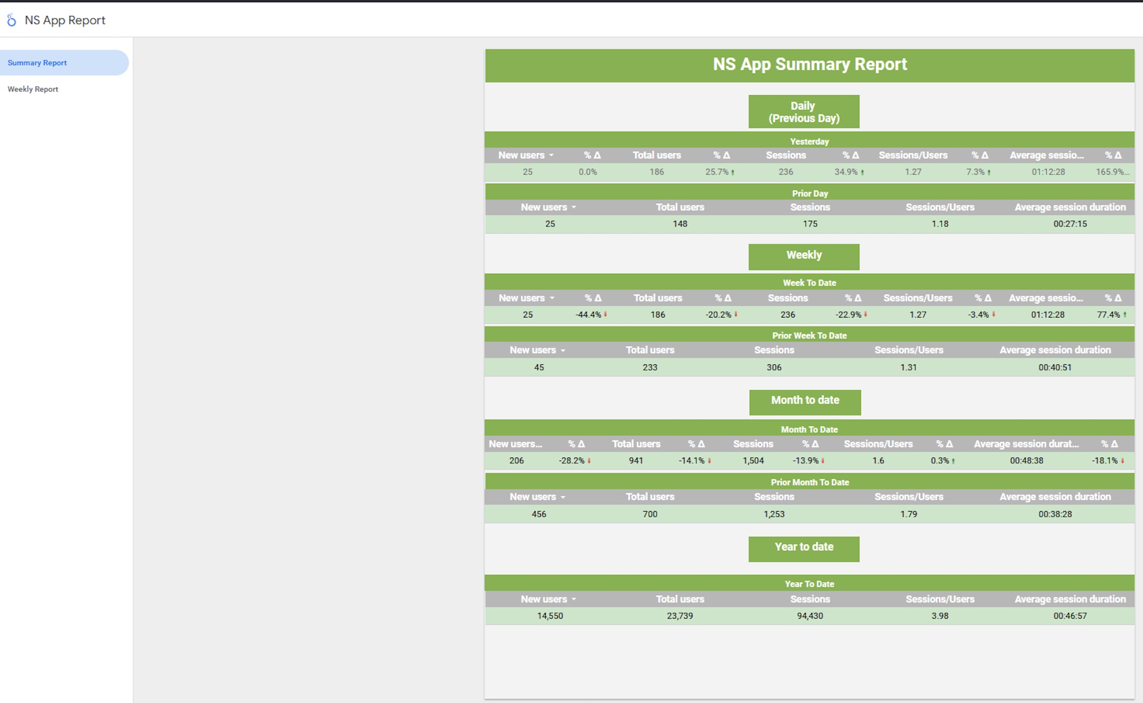
Monitoring daily user engagement is crucial for understanding how users interact with the app and identifying areas for improvement. By analyzing active users, session duration, feature interactions, and drop-off points, we gain insights into what keeps users engaged and where they face friction. This data helps optimize the Build Your Own Plan questionnaire, refine the UI, and enhance overall user experience. Higher engagement directly correlates with increased conversions, customer retention, and long-term success, making daily tracking an essential tool for continuous app improvement.
Interactive Elements
Jenny Craig App
Role
Company
Project Goal
The Jenny Craig app keeps users engaged in their weight loss journey with an interactive Weight Loss Journal and a Grocery Guide. The journal helps users track progress, log meals, and stay motivated through gamified tracking, achievement badges, and daily prompts. The Grocery Guide simplifies healthy shopping with personalized recommendations and meal-planning support, ensuring users stay on track. Together, these features make weight loss more interactive, rewarding, and sustainable.
Deliverables
Journal Page
The Journal Page is a personalized space for users to track daily progress, log meals, exercise, and water intake. With interactive progress tracking, users are encouraged to stay on track by using Jenny Craig meals with preset nutritional values or creating their own food entries while following the Grocery Guide for nutrition insights. This feature promotes healthy habit-building by making weight loss more structured, rewarding, and sustainable.
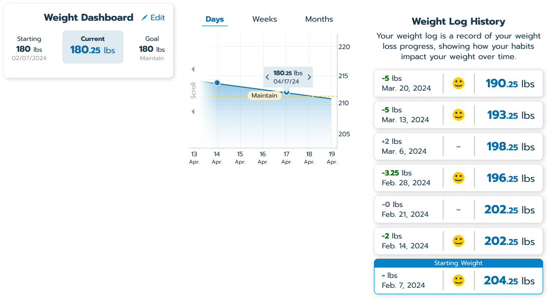
Progress Features
The Weight Loss Dashboard offers a snapshot of key metrics for total weight lost, keeping users focused on their goals. The History feature lets users review past entries, providing insights and reinforcing accomplishments. These features enhance engagement by making progress clear, accessible, and motivating.
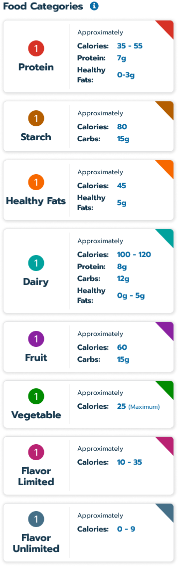
Grocery Guide
UBS
Role
Company
Project Goal
UBS wanted to design a new vision for their Consumer Facing Products. I was designer in a team of 3 people. The project was broken into two phases and lasted over 7 months. I communicated with stake holders and helped lead the team, which included 2 other Senior UX Designers.In phase 1 we delivered a design language that demonstrated across several products. Phase 2, we dove into the experience of the products, focussing on navigation, search, and notifications. Both phases used heavy usability testing, analysis, and iteration.My core responsibilities included design, design strategy, , field research, prototyping, usability testing, and presenting work to clients.Core deliverables for the project:
-Design language with 400+ components
-UX/UI documentation
-Hi-fidelity product designs
-70+ interviews and usability tests with stakeholders and users
-10+ prototypes illustrating hero flows and use cases
-30 person workshop with key stakeholders
-Design research deck
-3 online Usability Hub tests delivered to 150 participants
Deliverables
Design Research
We spent the first few weeks of the program immersing ourselves in the environment. We interviewed Financial Advisors (FAs) and Customer Service Advisors (CSAs) from four different UBS locations at their desks to watch them use their current tools.
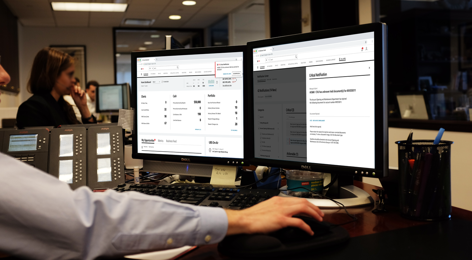
Usability Testing
To supplement the usability testing sessions, we sent out several online tests to augment our insights by leveraging Usability Hub to a pool of 60 participants.
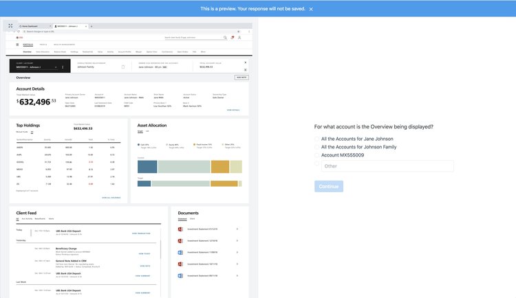
DESIGN SYSTEM
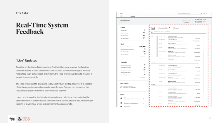
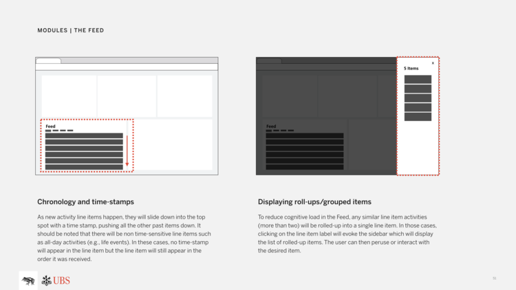
DESIGN LANGUAGE DELIVERY
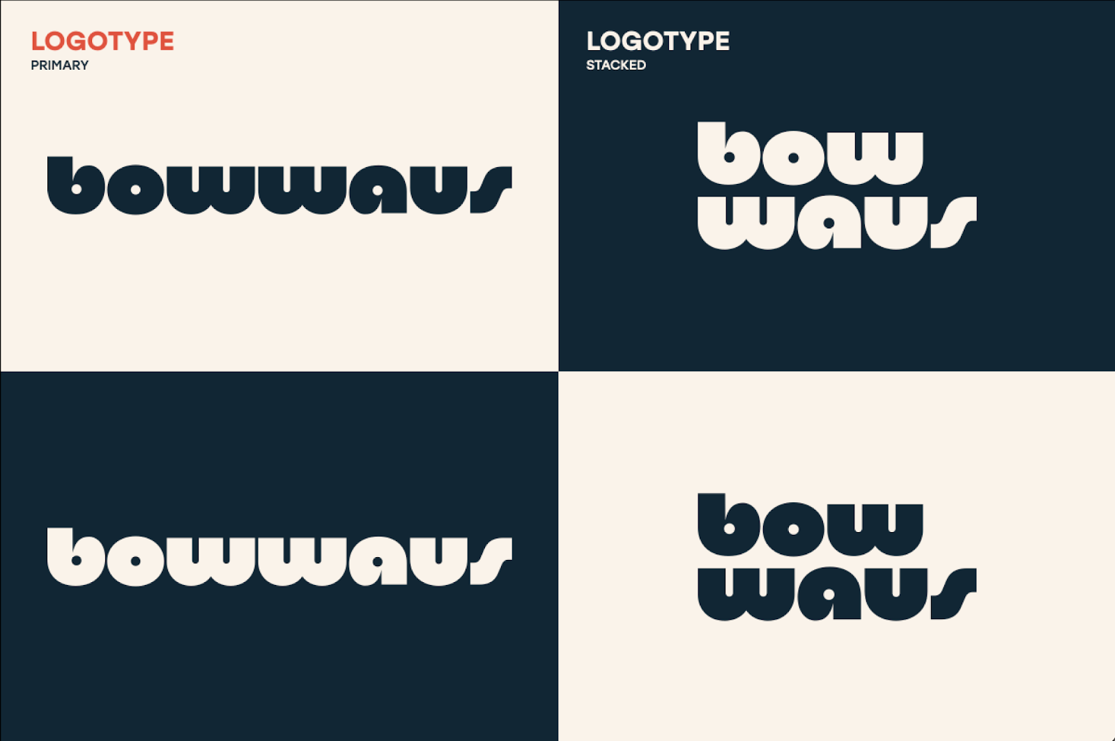
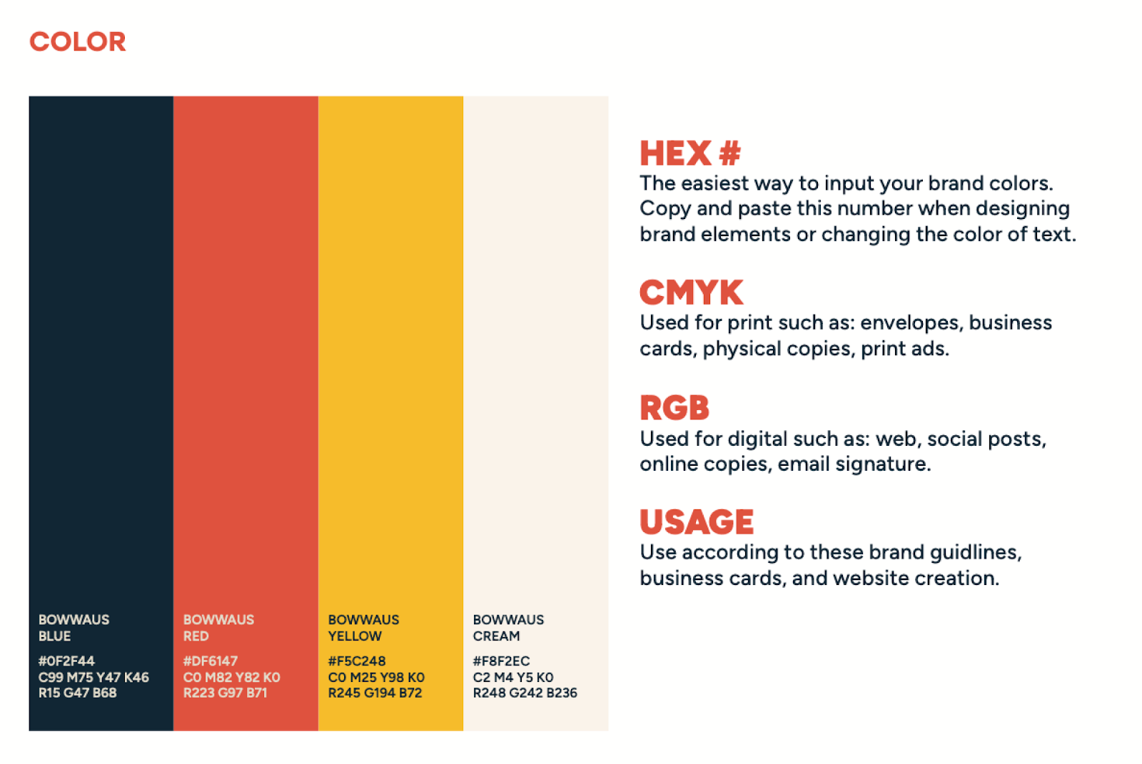
Bowwaus
Role
Company
Design Research
Using analytics from their websites, I was able to determine that traffic for the site resulted in 62% mobile, 37% desktop. Knowing this, the design for the website followed a mobile first approach.
DESIGN SYSTEM
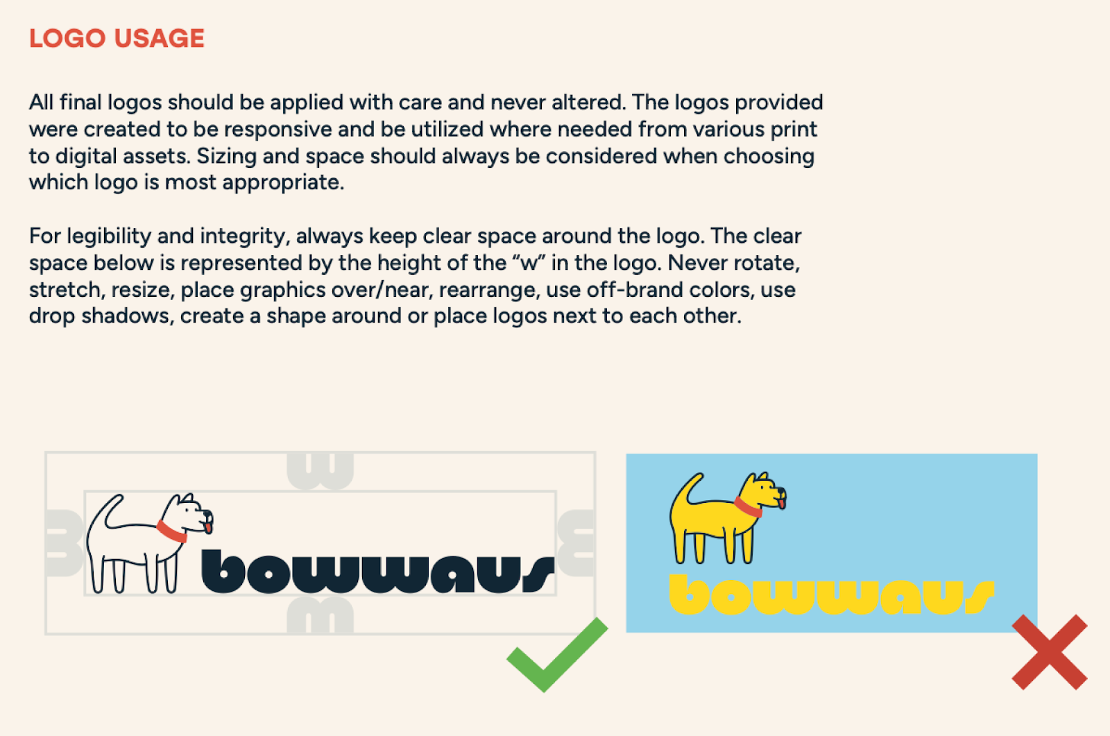
As part of the deliverables, documentation of the design system and all of its' assets were approved by the business owner.
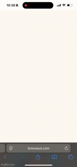
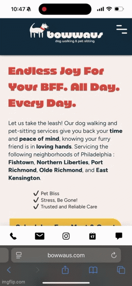
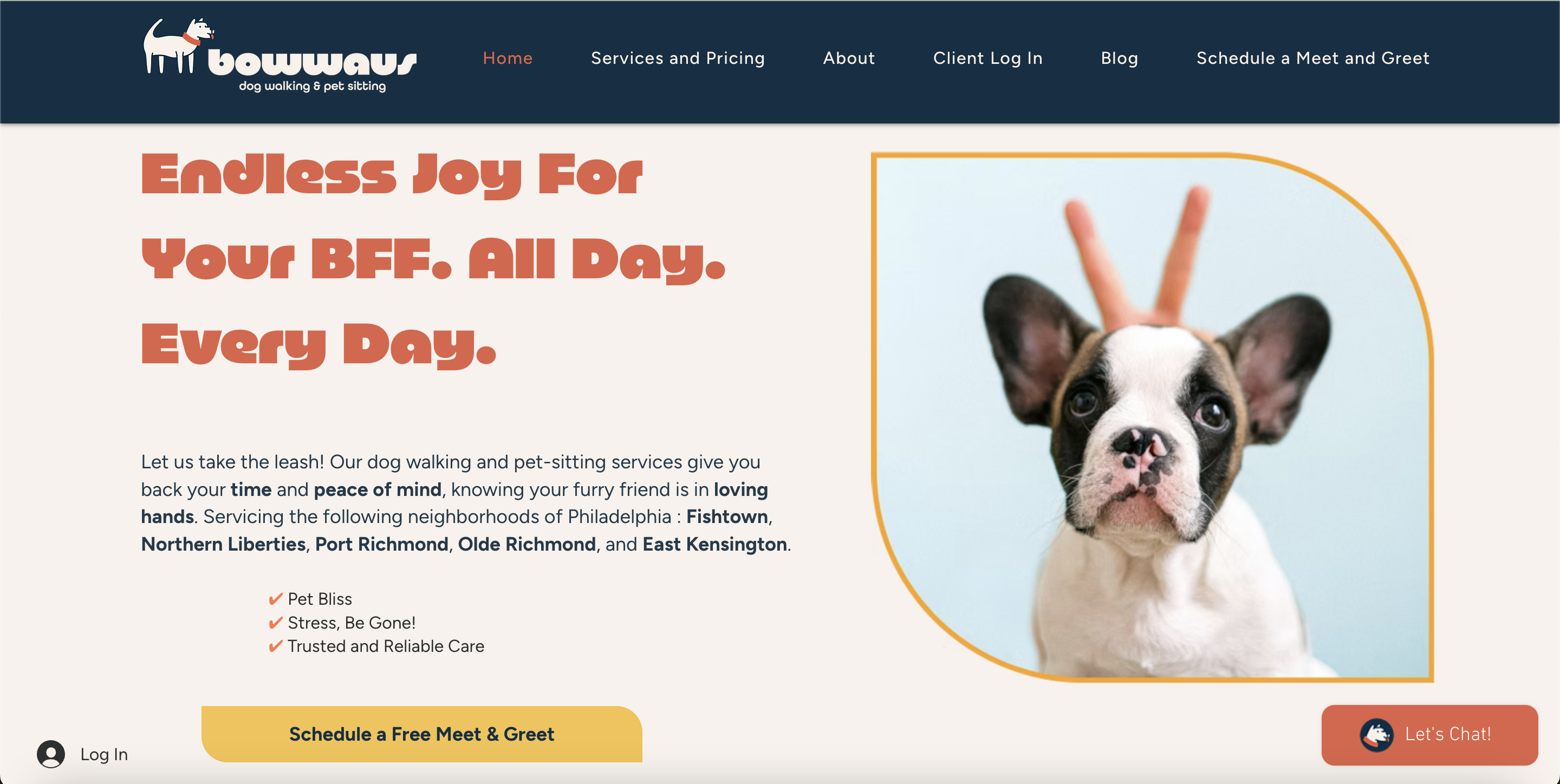
Usability Testing
The screens below were mocked up and then rebuilt on Bowwaus’s website. This replaced their original website and it is also responsive on all device sizes.
Mobile
Desktop
SalesBook
Role
Company
Job overview
I was the only UX designer that had 2 teams at Power HRG. One team focused on supporting accounting and the other corporate finance. I led over 20 different projects and successfully launched them.
Road Map
Research & Analysis
Initially I developed a list of questions to identify what works and what doesn’t for our users. These questions were specifically designed to find the “bread and butter” of what users log into the application for. Ex.What device do you use most when using the app?How often do you log onto the app?What are you typically looking for when you’re on the app?Do you navigate to other pages to find your data?I also included a couple of usability tests to determine the pain-points for users when navigating throughout the app.
Whiteboard and Sketching
Deliverables

UX Research Portfolio: Data-Driven Insights from Meal Delivery Prototype Testing
Role
Company
Project Overview
This UX research project analyzed user testing of a meal delivery service prototype, focusing on non-customers (female, aged 45–50). Using data analytics, I identified user behaviors, preferences, and pain points to improve the user experience. The prototype included a homepage (HP), secondary page (SP), related content sections (RCs), and Club Advantage (CA) membership.
Methodology
🎯
Objective
Uncover non-customer insights for meal plan comprehension and value perception.
👥
Users
10 females, 45–50, never purchased NS before
🛠
Tools
Google Sheets · GPT-4 · Miro · Userlytics · Figma
📈
Focus Area
Meal plan clarity, pricing, and brand differentiation
.png)
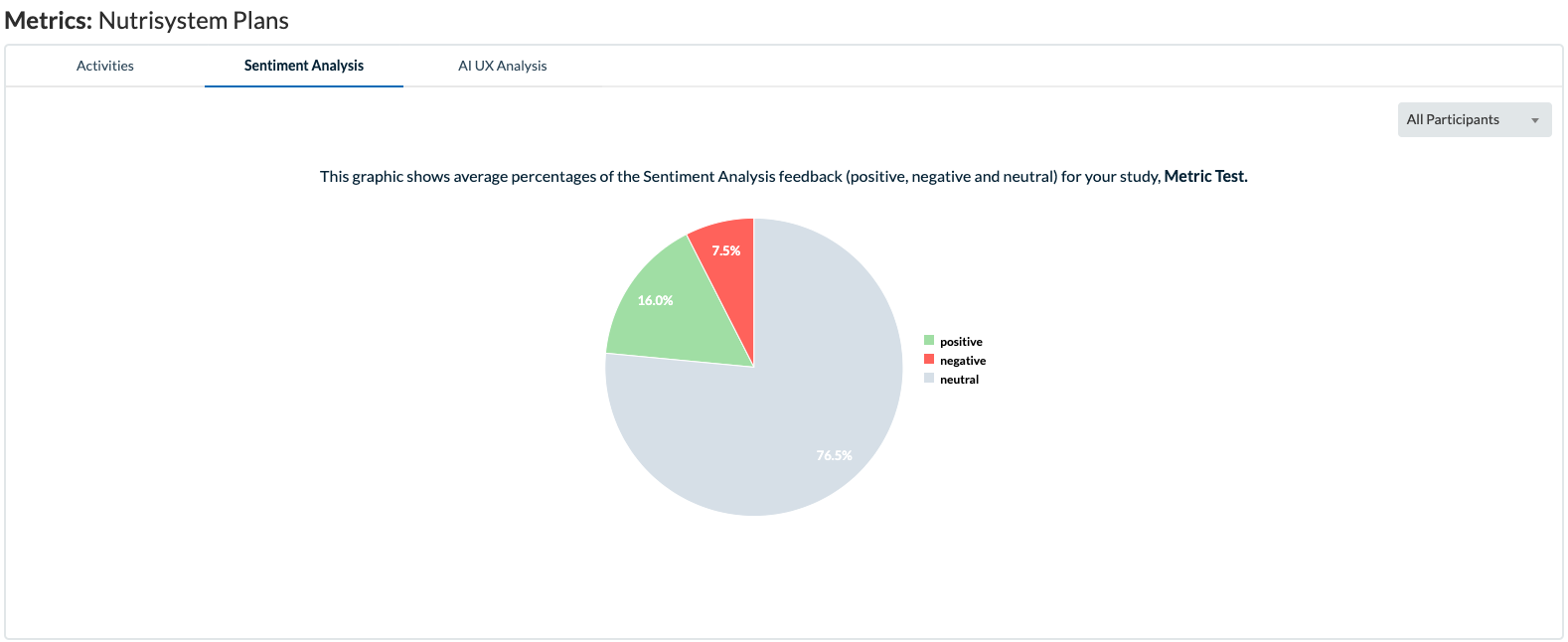
Key Findings
Data analytics uncovered critical insights:
- Meal Quantity Focus: 100% of users prioritized meal counts over other benefits. 60% struggled to identify quantities due to unclear presentation.
- Pricing Clarity Issues: 70% found pricing ambiguous, with 50% unsure if prices were weekly or monthly. 40% miscalculated HP/LC meals, assuming one meal/day.
- Club Advantage Confusion: 80% were confused by CA’s inclusion as a “plan,” with 60% unclear about its $70 base price and meal model.
- Plan Differentiation: Only 30% initially understood HP/LC vs. JC differences. After prompting, 90% identified distinctions, but branding had no impact.
- Visual Appeal: 100% appreciated food photos and nutritional callouts. All scrolled plan cards, but only 40% recognized four distinct plans.
- Program Perception: 80% viewed the Program as comprehensive (3 meals/day, 7 days/week). Only 20% noted its regimented structure.
.png)
Data Visualization
Recommendations
Based on quantitative and qualitative analysis, the following UX improvements are proposed:
- Highlight Meal Quantities: Use numeric digits (e.g., “3 meals/day”) on SP and RCs to reduce 60% confusion.
- Clarify Pricing: Add time references (e.g., “per week”) to SP prices, addressing 70% of concerns.
- Redesign CA: Visually separate CA from meal plans to clarify its membership model, reducing 80% confusion.
- Simplify Plans: Use icons or tables to highlight HP/LC, JC, and Program differences, improving comprehension beyond 30%.
- Strengthen CTAs: Replace CA’s “Select Meals” with “Explore Meals” to boost engagement (0% engaged in prototype).
- Expand FAQs: Address delivery, meal freshness, and logistics, as 50% sought more details.
Impact
Implementing these recommendations is expected to:
- Reduce user confusion by at least 50% for meal quantities and pricing.
- Increase plan selection confidence, particularly for CA, by clarifying its value.
- Enhance conversion rates by streamlining decision-making for busy, health-conscious users.
Conclusion
This project showcases my ability to leverage data analytics in UX research, quantifying user feedback (e.g., 80% CA confusion) to deliver actionable insights. The recommendations enhance clarity, navigation, and trust, creating an intuitive experience for the target audience.

Analytics: E-commerce
Role
Company
Project Overview
Goal: Improve user engagement and content discoverability on a high-traffic marketing website.
Tools: Google Analytics 4 , Heatmaps (Clarity), UX heuristics
Analytics-Driven Discovery
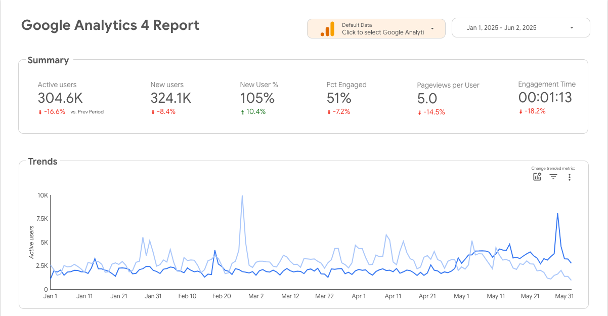
- Active users dropped by 16.6% and engagement time by 18.2%, signaling potential content fatigue or slower page loads.
- New user percentage increased by 10.4%, but engagement dropped, indicating poor first impressions or irrelevant landing experiences.
- Spikes around late Feb and end of May suggested campaign impacts.
- These were aligned with specific marketing pushes — but did not lead to sustained engagement.
Key Findings
UX Decisions Based on Device and Region Insights
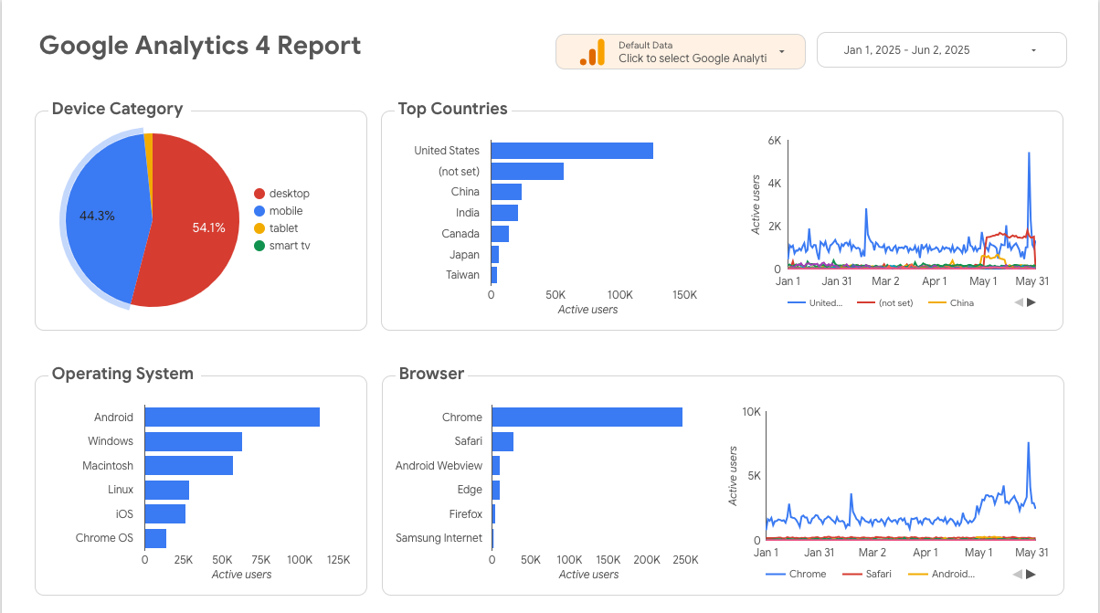
- 54.1% of users were on mobile, yet mobile experience had longer load times and more friction in event flows (scroll, CTA taps).
- Chrome on Android dominated browser/OS combos → Focused testing on that environment.
- Top geographies: U.S. was leading, followed by untagged traffic ("not set") — prompted improved UTM tagging for email/social campaig
Event-Level Behavioral Insights
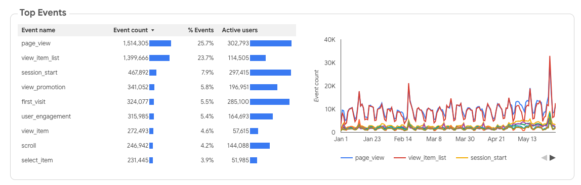
- Page views vs item list views were nearly equal → Users skim product listings but often don't go deeper.
- User engagement was only 5.4% of total events → Indicated need for more interactive content or clearer calls to action (CTAs).
- Scroll depth was low → I redesigned the homepage to surface more value above the fold and simplified nav structure.
Event-Level Behavioral Insights
- The homepage (/) captures 58% of sessions but has a 46.7% bounce rate.
- The “(not set)” landing page also draws significant traffic (50%) but with a 99.5% bounce rate, likely caused by misattributed or broken campaign links.
- Audited tracking issues for “(not set)” to properly route attribution.
Event-Level Behavioral Insights
- Conversion spikes are rare and inconsistent, with most days seeing low purchase volumes.
- The “(not set)” landing page also draws significant traffic (50%) but with a 99.5% bounce rate, likely caused by misattributed or broken campaign links.
Recommendations
Based on quantitative and qualitative analysis, the following UX improvements are proposed:
- Content Reprioritization: Above-the-fold redesign to match high-interest content from view_item_list trends.
- Mobile Optimization: Reduced hero image size and decluttered UI for faster load and easier navigation.
- Behavior Tracking: Added custom GA4 events for CTA clicks and exit intent on mobile.
- The highest peak (~700 purchases) occurred late February, possibly linked to a promo or campaign (worth replicating).
- Suggested A/B testing hero sections and simplifying above-the-fold content on the homepage to reduce bounce.
- Optimized /shop/apparel subpages with better filtering and product previews.
- Recommended aligning UI changes with campaign schedules (e.g., updating hero banners or promo sections).
- Proposed adding urgency indicators (like countdown timers or “limited stock” badges) on product pages to lift conversions.